
CD’s Strength & Training is a performance-focused fitness brand dedicated to helping clients build strength, confidence, and long-term consistency. The goal of this project was to create a brand identity that reflected the discipline and intensity of strength training while remaining approachable and motivating for a wide range of athletes.
I began by researching the competitive landscape within the fitness and personal training space, identifying a common overuse of aggressive, hyper-masculine visuals that often feel intimidating to newcomers. Through conversations with the client, it became clear that CD’s Strength & Training prioritized education, proper form, and sustainable progress, not just aesthetics.
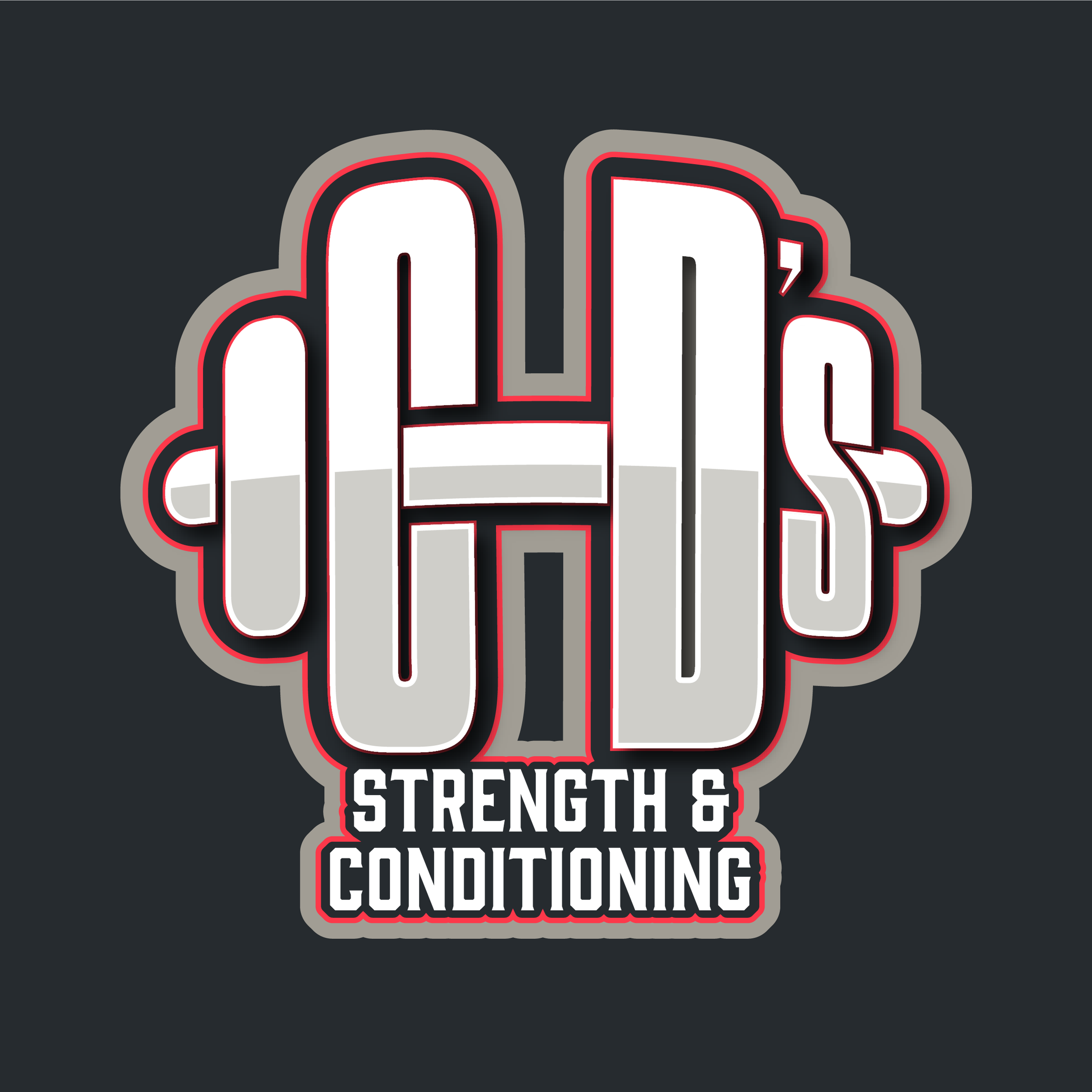
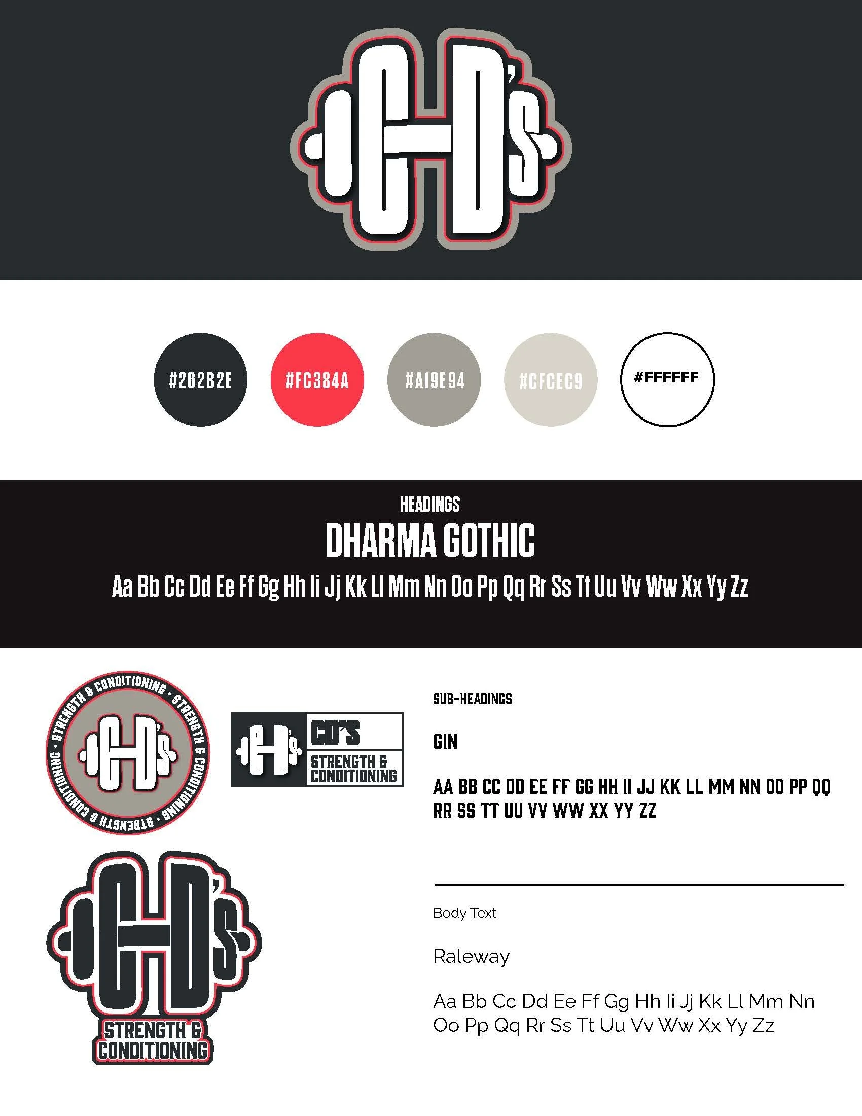
The visual identity was designed to balance power and clarity. I explored typography that felt bold and grounded without being overly aggressive, paired with a restrained color palette that reinforced strength and focus. Graphic elements were inspired by movement, balance, and structure—subtle references to form, alignment, and progression.
The final identity positioned CD’s Strength & Training as welcoming, powerful, and athletic fitness brand. The system supports both marketing and community-building efforts, giving the client a clear visual foundation to communicate their philosophy and connect with current and future athletes.
This project highlights my ability to translate brand values into a strategic visual system and design identities that feel both purposeful and enduring.